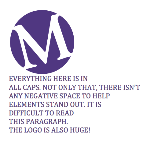
As a college student, and by that I mean a poor and hungry young person, I remember buying a lot of used textbooks at discounted prices to save money so I could indulge in mounds of $5 Domino’s pizza to get me through the week. Sometimes, I would buy these textbooks online in “excellent” condition, only to open up a 300-page book that could be seen from the moon in all of its pink and yellow fluorescent glory. Every other sentence was highlighted, paragraphs upon paragraphs were underlined, and “Amber” must’ve had a grand ol’ time turning her textbook into a glow in the dark piece of art. She also could have failed Economics 161.
The concept of highlighting is to bring out key elements embedded in a body of information—to create a visual hierarchy. The same can be applied to practicing good design. We like to use an acronym in design to help us achieve this in many different ways.
Proportion
Unity
Relevance
Excitement
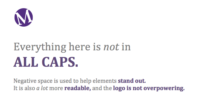
PURE design. To demonstrate the importance of this, take a look at the design that embodies “Amber’s” style:
Versus:
 Using size and color to our advantage, we are able to call out items and create a contrast between certain key points in our statement. There is also a clear separation between headline and body text, yet it still flows as one unified piece of information. Also, the logo doesn’t have to be the biggest thing on the page in order for it to stand out. The positioning and the negative space around it is enough to make a small logo stand out in a sophisticated, clean manner.
So the next time you go to highlight a newsletter, or direct the creative of an ad or business card, remember that size does matter—so do it right!
-Randall Loui
Graphic Designer
