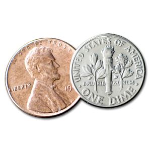
The dime, although smaller and lighter in weight, is worth more than its brethren one-cent piece and its cousin, the nickel. The assumption that an increase in size leads to an increase in value is a natural one (though, hopefully, everyone automatically recognizes the dime as more valuable at this age)—bigger is better! However, the content and quality of it all can be the first oversight. This comparison can also be made to daily design work—many believe that ads, brochures and websites need to be as long as possible. Everything about your business needs to be spelled out, and you want big logos and graphics everywhere to stimulate the audience!
On the contrary, my dear Watson.
A clear concise message with tasteful graphic decisions is not only more effective, but believe it or not, more attractive than having a plethora of imagery, text and rainbow gradients. I have had the pleasure of working with one of our client’s brand style guide for the past few months. It is strict and simple: three column grids, defined zones for images, consistent logo usage and fonts—all of this, coming from a successful brand that has been around for years, without a mention of a starburst-callout in sight.
Although the minimalist movement is here, many companies are still firing at will when it comes to content. Sit back and evaluate your copy and design choices. Read and examine your own material—see how long it takes and ask yourself if your audience will commit the same amount of time as you did. Trim the fat, lighten the load, take some junk out of that trunk and you’ll get your message across without the clutter. After all, wouldn’t you be annoyed if the cashier gave you 10 pennies instead of a dime?
