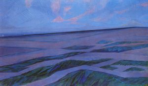
Piet Mondrian’s “Dune Landscape,” 1909
By Randall Loui
At Mustang, we are always trying to create the very best designs for our clients. Whether it’s an ad for flame-resistant clothing, a brand book for internationally renowned beauty products or swag for a local credit union — our end goal is to make marketing collateral that is visually appealing and that conveys a clear message.
But what exactly constitutes good design? In my opinion, good design is inspired. It pulls from our existing knowledge and creates something new… ish. I prefer to say “newish,” because that’s how inspiration works — we can create something that we think is totally original, but, in reality, it’s more than likely inspired by something we’ve seen or experienced before that’s stored in our memory bank. We’re always pulling from our own experiences. Therefore, being exposed to different styles and work only adds to our library of things to pull inspiration from.
For me, it is graphic designers like Neville Brody (known for his iconic Just Do It-themed Nike ad) and Chip Kidd (known for his book covers and creating the Jurassic Park logo), artists like Roy Lichtenstein and Piet Mondrian, and the streamline modern art movement that inspire my daily designs the most. For the other designers on our team, inspiration may come from somewhere else.
Hence: our biweekly art talks. Every two weeks, Mustang’s design team meets to discuss both current and historical topics in art. These talks are not limited to one genre; rather, they are open to all forms such as architecture, products, paintings and more. In the past, we’ve covered logo redesigns of 2015 and the Art Deco movement, discussed the work of Alphonse Mucha and Turner Duckworth, and watched Chip Kidd’s latest TED talk. Afterwards, we hold an open forum where we discuss the presentation and how we can apply it to our everyday work.
Because of these varied sources of inspiration, I don’t like to assign my work to any single particular style — nor do I think that there is any one style that makes for the best designs. If there is any consistency in my style, it is probably the use of clean lines and fonts. But who knows, maybe after our talk on Jackson Pollock I’ll be adding a bit of abstraction to my linearity.