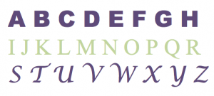
Marketers have been known to spend hours, weeks and even months trying to craft the perfect content to showcase their brands. But at the end of it all, sometimes they still miss a key piece of the puzzle: It’s not just about what you say — it’s about the font you say it in.
Just like colors, fonts have the ability to subconsciously generate perceptions about your brand. While each individual person has a unique set of experiences that may influence their perceptions, there are a few common associations with various categories of fonts:
- Serif fonts, like Times New Roman and Cambria, can create the impression that a brand is traditional, reliable and respectable.
- Sans serif fonts, like Arial and Calibri, often convey that a company is stable, simple/sensible and straightforward.
- Script fonts, like Lucida Calligraphy and Zapfino, tend to give brands a personal, feminine, elegant feel.
- Display fonts, like Cooper Black and Stencil, can help companies come across as friendly, quirky and unconventional.
- In general, familiar fonts can help establish trust, but less common fonts can help grab attention and differentiate your brand.
With the wide selection of fonts available in each of those categories, finding the right match for your goals can seem overwhelming. Here are a few considerations to guide your thinking as you choose:
Legibility
The less legible your font is, the more effort it takes for your audience to read it. This can work against you in a context where your readers are likely to skim through your content and may stop reading if the information they’re looking for can’t be easily found. If you want to ensure your message is communicated quickly and clearly, it is usually best to stay away from less legible fonts. However, in the right circumstances, the effort required to decipher a tricky font can be leveraged to engage your audience and hold their attention.
Buyer Personas
As with most marketing-related decisions, knowing your audience is key. By understanding the priorities and personalities of your target buyers, you can select a font that communicates the right messages. For example, if your audience is primarily composed of tough, hardworking men, a delicate script font is typically not the best choice.
Consistency
Using a consistent font across all of your marketing platforms and materials can help to establish a strong brand identity — a key component in building awareness and trust among your audience. While there are always strategic exceptions, consistency is generally a strong rule of thumb, so it’s important to select fonts that translate well across your various marketing efforts (e.g., your website, brochures, signage, swag and beyond).
Here at Mustang Marketing, our font of choice is Neutra, which looks like this:

Does your brand have a signature font? Share it with us on Facebook!