Workrite Website Workrite’s website redevelopment had a clear mission: to turn the site into an industry hub for flame resistance (FR) professionals worldwide. No small task. The emphasis for content was education, objectivity and interactivity; for design, a streamlined and eye-catching look, with plenty of copy “call-outs” to keep the reader engaged throughout pages with
Category: Workrite
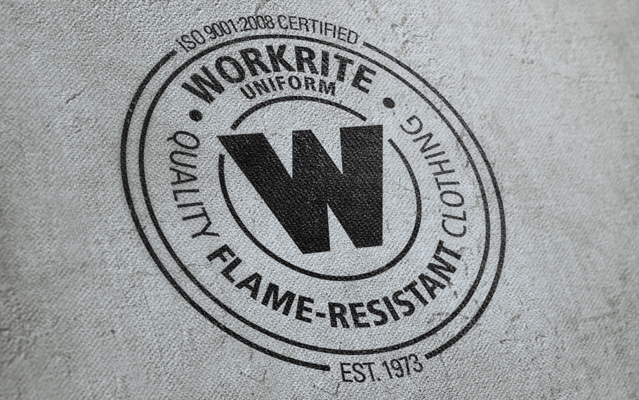
Anniversary Seal

Discussions of Workrite Uniform Company’s 40th anniversary campaign had been long underway before Mustang came up with the “seal” logo idea. For a company milestone this significant, we wanted a visual that not only matched the achievement, but Workrite Uniform’s success and reputation in the flame-resistant clothing industry. The “seal of approval” look was a
Lead Generation
The goals for a lead-generation postcard speak for themselves, and it was Mustang’s job to come up with a visual approach that tied into the overall Workrite brand, but still garnered the necessary interest and attention it takes to, well, generate a lead. In order to determine how successful this particular postcard was, Mustang utilized
Corporate Folder
Workrite Uniform Company’s latest brand-within-a-brand campaign required several pieces of collateral, but the linchpin was their new brochure highlighting what all three of their flame-resistant (FR) workwear brands had to offer. We also designed an accompanying folder to hold the brochure, and any other pertinent marketing materials for their sales force to use as leave-behinds.
Workrite Hang Tag Booklet
These information-rich booklets accompanied Workrite’s flame-resistant (FR) garments in select stores to provide consumers and retailers with a more in-depth look at each garment: its fabric, which standards it meets, FR FAQ, and care and maintenance instructions. In order to avoid overwhelming or weighing down the garment, the booklet had to be small, but also